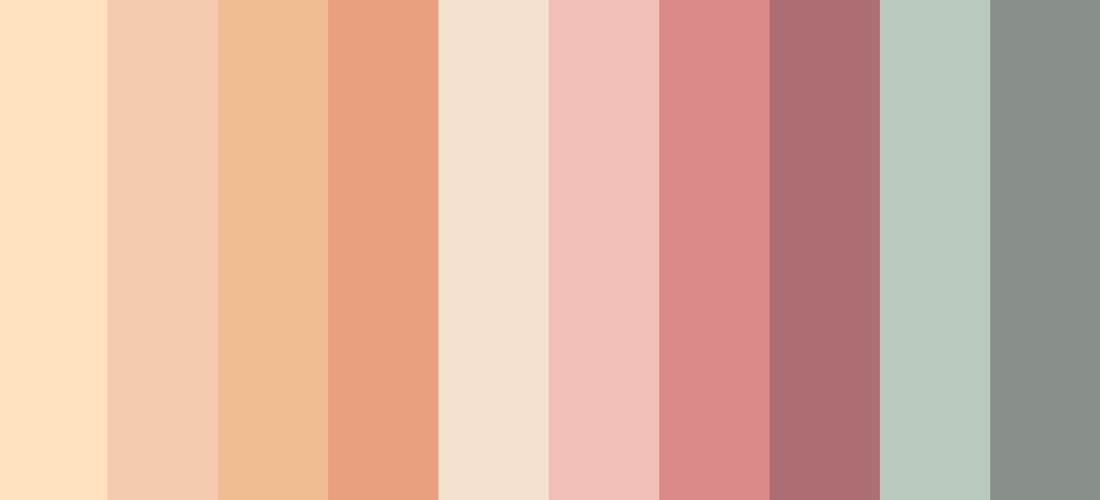
This is a bit of a random post, but while I was working on a poster commission recently, I got a little overwhelmed with picking a color palette that was harmonious while still suiting the project. I ended up using coolors.co to help generate some possible ideas. Since then I’ve also created a whole bunch by color picking from previous illustrations of mine, it was interesting to see what color families I tend to favor! Lots of ruddy earths, turquoises, mosses and olives, peaches, dusty roses, and lavenders and lilacs. I seem to avoid strident blues even though they’re growing on me recently, but I always love powdery soft ones or if they’re dark and moody like Indanthrone or a bluish Payne’s Gray.
A lot of them are taken from marker drawings, and since I have some go-to colors there’s some overlap but still nice variation. Some are from watercolor or colored ink, and some pure digital. I thought I’d share them here just because they’re pretty. If you’re looking for some color inspo for your own art, maybe they’ll come in handy?